Difference between revisions of "Wizard LnF"
(New page: Category:LnF_guidelines) |
|||
| Line 1: | Line 1: | ||
| + | <span style="color: #ff9900">'''Wizard LnF'''</span> | ||
| + | |||
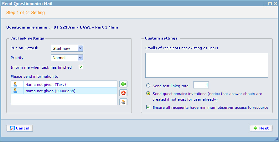
| + | To make wizards look good and be easy to understand across different modules we need to decide on a generic style. This style is specified below with examples. | ||
| + | |||
| + | The name of the dialog should be the general name of the wizard. After the 'Step n of n' text should be the name of the specific step. | ||
| + | |||
| + | The styles should be available for the generic style sheet. These should be set to: | ||
| + | |||
| + | - Top background color: F2F2F2 | ||
| + | |||
| + | - 'Step n of n:...' text color: FF8A00 | ||
| + | |||
| + | - Middle background: E5E9ED | ||
| + | |||
| + | - Bottom background: D2DEE9 | ||
| + | |||
| + | - Line color: 77A2C4 | ||
| + | |||
| + | - Please use top, bottom, left, right margin for all content in Top, Middle and Bottom section: 15px | ||
| + | |||
| + | - Try to make the same with layout from designer as much as you can ( if any): distance between elements, width and height of the same controls, font size, color,.. and use CSS for all things. | ||
| + | |||
| + | - If we don't have Top section, please remove them from layout. | ||
| + | |||
| + | - Error message will be above the Middle section and below the Top section, but better is using pop up for Error. | ||
| + | |||
| + | - If you have grid control in the Middle content, please use white background for it, not use the same color with Middle background. | ||
| + | |||
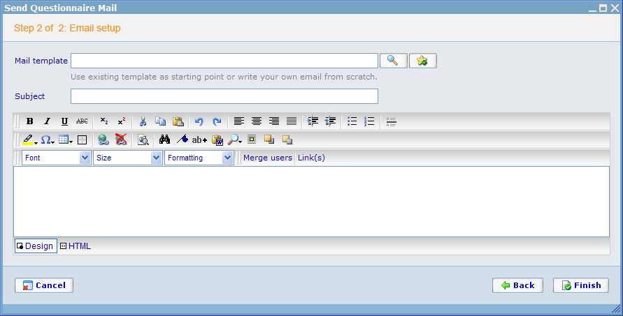
| + | - If you have texts for explaining the control please use color: 999999 and put it below the control (You can see it in the second image below). | ||
| + | |||
| + | - Align Cancel button to the left and right for others. <br>[[Image:Wizard-1.jpg]] | ||
| + | |||
| + | [[Image:Wizard-2.jpg]] | ||
| + | |||
[[Category:LnF_guidelines]] | [[Category:LnF_guidelines]] | ||
Revision as of 09:19, 24 December 2008
Wizard LnF
To make wizards look good and be easy to understand across different modules we need to decide on a generic style. This style is specified below with examples.
The name of the dialog should be the general name of the wizard. After the 'Step n of n' text should be the name of the specific step.
The styles should be available for the generic style sheet. These should be set to:
- Top background color: F2F2F2
- 'Step n of n:...' text color: FF8A00
- Middle background: E5E9ED
- Bottom background: D2DEE9
- Line color: 77A2C4
- Please use top, bottom, left, right margin for all content in Top, Middle and Bottom section: 15px
- Try to make the same with layout from designer as much as you can ( if any): distance between elements, width and height of the same controls, font size, color,.. and use CSS for all things.
- If we don't have Top section, please remove them from layout.
- Error message will be above the Middle section and below the Top section, but better is using pop up for Error.
- If you have grid control in the Middle content, please use white background for it, not use the same color with Middle background.
- If you have texts for explaining the control please use color: 999999 and put it below the control (You can see it in the second image below).

