Cross diagram
Cross diagram
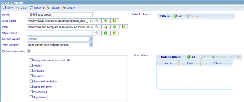
Setting up a cross diagram is a lot easier than using it. Let us initially see how a cross diagram is set up:
To generate a tracking diagram you must/can specify the following information:
Name: A unique name to identify the resource.
Data cache: You must specify where the data for the dynamic diagram is retrieved from.
Monitor path: You can specify that the cross diagram belongs to a specific monitor site.
Style sheet: Important to specify how the results of the cross diagram will be presented.
Default weight: This drop down will display all possible weight columns. As you will see in the next field, your choice here may either be seen as a default that the user can change or a forced weigh, that the user has no control over.
Weight view: There exists two ways in which the weight option can be treated in the cross diagram viewer.
- User cannot see weight choice: if no default weight was chosen then it will never be possible for the user to apply weights to this cross diagram. If a weight was chosen then he cannot change the fact that this weight will impact all the analysis he will make on this diagram.
- User can see weights choice and choose: the user will be able to choose if a weight is applied. If default weight is set then the default weight will have been chosen when users initially open the cross diagram viewer.
Default state setup: You can here choose what the the default states are for all the check boxes that are offered in the viewer. Please read more on the viewer further down in this help file to understand each of the different settings.
Default filters: It is possible for the user to apply filters when using the cross diagram viewer. If we want the cross diagram viewer to have some default filters applied when he initially opens the viewer, we can set it up here. If we do not wish the user to know that a filter is applied we can choose to hide it. This will mean that all results of the diagram viewer that the users see will be forced to apply this filter.
Hidden filters: Hidden filters are a new feature from version 5.5 that allows us to show dynamic and static diagrams as well as reports, while filtering all the results based on which group the user belongs to. It is basically an alternative to generating a lot of diagrams/reports each with individual filters. With hidden filters it is possible to do the same with just one instance of a report or a diagram. An example could be that you want to show the gender segregation of the department a user comes from. We can then add one hidden filter for each department (where department is a group where the user is member) and specify a filter that ensures only showing the result from that department, like 'Department==12'. Since we cannot be sure that a user only belongs to one of the specified groups, it is necessary to index the hidden filters. If a user viewing the report or diagram then belongs to more than one of the stated groups, he will only get the diagram/report he is viewing filtered on the highest indexed hidden filter (the one placed highest on the list). If the logged in user does not belong to any of the groups/users of the hidden filter list, then no hidden filter will be applied. Hidden filters are always combined with other types of external filters.
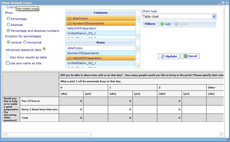
Now let us look at how the cross diagram looks in the viewer.
You will notice that using the cross diagram viewer is very similar to making quick reports.
Let us now understand how the 'diagram setting' area works!
Show Percentage/Absolute: Depending on the chart type chosen, you will be able to decide whether the results of the diagrams being created are going to be represented as absolutes or percentages; or, when choosing tables, as both!
Direction: Can be used for table, bar and line charts. This setting will decide if columns are set as x- (vertical) or y-axis (horizontal)!
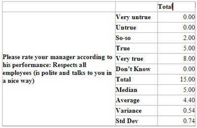
Advanced statistical data: This choice is only available when choosing to show a table diagram type in a vertical direction. What will happen in this situation is that a number of additional rows will be added that shows additional information on the table like Median, Average, Variance, Standard Deviation, Standard Error and Significance. These information you will have to choose by expanding this area and selecting the statistical information you want. When not expanded no statistical information is shown.
Use axis name as title: Since axes are automatically created from questionnaires, we may often have axis texts that are long. This could for example be "Please specify what your gender is". If we have ensured that the question labels are more exact, or perhaps we have later redefined the axis names, then we can choose to use these instead of the axis texts. In this example the axis name may well have been "Gender", which will also be a suitable title to show gender statistics. Whether or not you want to choose it depends entirely on how you specify your axis labels. If you are not certain you generally want to leave this value unchecked.
Weight: If the data of your diagram needs to be weighed you can here choose among all the weight type columns of your data cache and axis set. To learn more on making weights for data caches please click here! Notice that this setting is hidden if the axis set of the data cache you are using does not have any weight columns specified.
Filters: If your diagram needs to show data for only a subset of the data material you can here add a general filter. Make a diagram that shows the data for only women.
Columns and rows: The place you choose your data material from. Please read more on the axis set to understand how these data items are created! Notice that you can choose multiple rows and columns to generate multi level diagrams! Also notice that you must click CTRL when un-checking a selected row or column. What you may notice is that when you choose more than one row or column there may be specified a number (1) or (2) in front of the chosen axes. This is for the purpose of multi-level diagrams, where the number specifies which of two chosen axes will be the upper segregation of results, and which will be the lower.
Updating results: To view the resulting diagram of the filters set up in the filter area you just need to click the update button. If any of the expressions that are used for generating the image return error, then these will be interpreted as null or zero. If you are not sure of what the actual reason is that a value shows null or zero, there are two hidden update buttons that can help you clarify what lies behind the values you are presented to. These are:
Alt+T: Will show your results with actual error messages in the cells that have problems.
Alt+P: Will show your results as the expressions that will be made to get the final results.


